
Hannahs is a New Zealand icon, with a shoe manufacturing and sales history stretching back over 150 years. When working with such a well known business, we do feel a sense of responsibility.
The company recently changed hands, and the new owners wanted to create a clean, fresh, new look, without any radical u-turn in the store aesthetic, which might upset the loyal middle-New Zealand market.
Despite their enviable history, the company’s new owners stressed that Hannahs continues to be first and foremost a fashion brand. A brand that looks forward rather than backward. They also requested that the fit-out should be about the customer and their ability to see and feel the products. Their store was to complement rather than overpower the product or visual merchandising elements. It was required to be very customer-focused, featuring a large seating area, so staff could assist customers to obtain the perfect fit for their shoes.
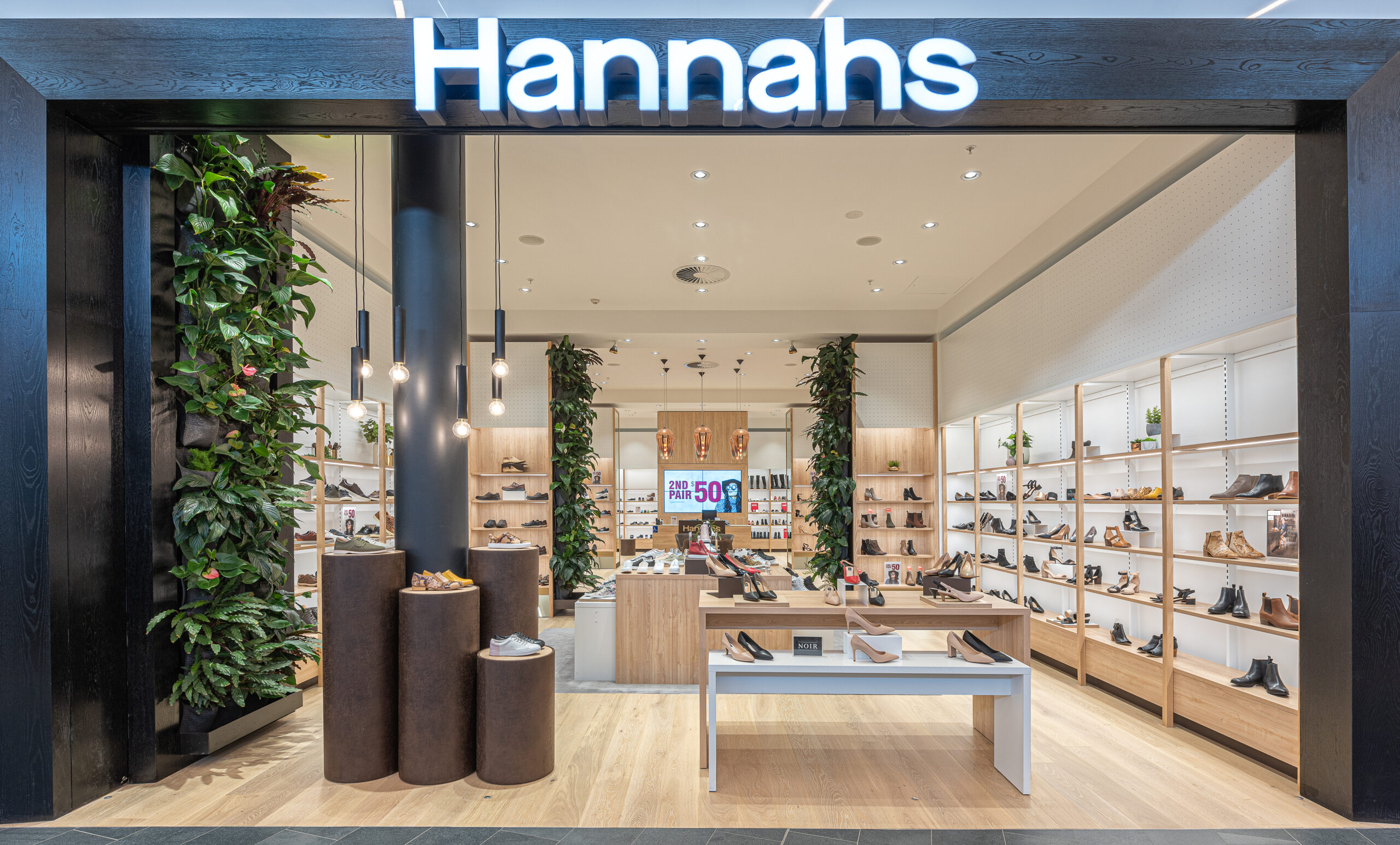
The pilot site chosen is a 180m2 tenancy in the new Tauranga Crossing shopping centre. The site is an “L” shape, which enabled us to put the storeroom across the rear of the tenancy and use the front of the store for the customer space. Our clients suggested we should divide the store into three zones or “rooms”, by subtly bringing out feature bays from the side walls. These “rooms” are also defined by changes in flooring materials. These zones feature impulse displays at the front, the customer seating area in the middle, and the point-of-sale counter and kids department at the rear. A large audio-visual screen dominates the back wall to allow the brand to showcase their video collateral and new product shots. The store is impressive and inviting.
Our team created a new retail fixturing system which is completely modular, so it can be applied to other stores, including refits of existing sites. With a ceiling height of four metres we were able to take the fixturing almost full height. There is no requirement for shelving at the highest part, so this was left as a neutral band comprised of steel peg-board panels. These enable signage or displays to either be fitted into the peg-board holes, or for graphics to be attached magnetically.
Our clients wanted excellent product lighting, in a way that enabled shoes on the bottom display shelves to be as well-lit as those at the top. This required an individual lighting system fixed into each shelf. It was a challenge to come up with a design which allowed these to be safely moved (along with the wiring) each time the shelf was adjusted, to accommodate different size products such as high boots in winter. With the wiring hidden inside the front post and the transformers hidden in the plinth at the bottom, the entire wall system can easily be reconfigured without tools or electricians. The fixturing itself remains deliberately understated with a neutral palette of white metal posts clad over with a solid ash clashing and oak laminate shelves.
The shopfront was left largely open so customers can see the whole store from the outside and can easily drift in to browse the impulse display tables at the store front. Our clients were very keen to incorporate some green walls to lend an element of naturalness and softness to the interior. These posed some reasonably significant challenges in terms of retrofitting plumbing, drainage and grow lights to the space, and we believe it was well worth the effort. Signage is a simple illuminated “Hannahs” wordmark reflecting the company’s revised logo.
The customer area in the centre features a circular, communal seat that a number of customers can sit around during fittings. This is covered in real leather as a reflection of the products stocked in the shop. This area is high-lighted with Tom Dixon “Fade” lights. The counter is a mixture of oak laminate and a synthetic stone product for durability.
High quality pure-wool rugs and real oak floors were chosen to reflect Hannah’s simple quality focus, while also enhancing the customer experience when going bare-foot as they try on shoes. Angled mirrors built into the bottom of feature bays make it easy for customers to see their feet from several angles.
The overall design, although deliberately subtle, has marked a distinct shift in the brand and customers are loving it. The store is also trading well with excellent sales. This format is now being implemented elsewhere.